Best Practices for Using Images in Emails (2026 Guide)

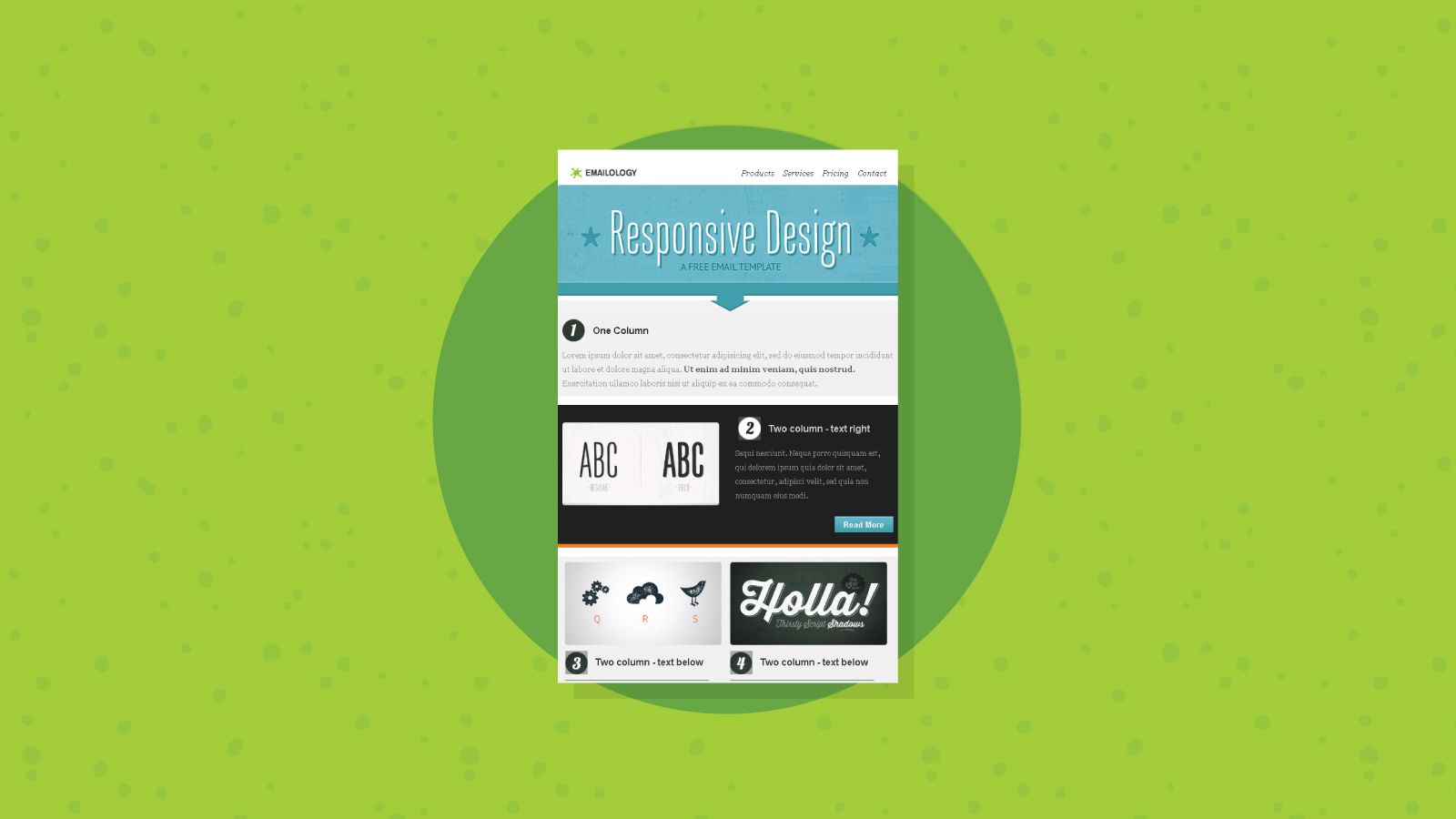
Images have become a core part of modern email. Product shots, banners, infographics, and personalized graphics all help you capture attention faster than text alone, and the numbers back that up. Emails with images can earn a 42% higher click-through rate than plain text versions, and content paired with relevant visuals gets far more views. The catch is that the same images can quietly work against you. Poorly optimized files, image-only layouts, and missing alt text hurt load speed, accessibility, and inbox placement. These best practices help your visuals support the message instead of sabotaging it.
Why images matter (and where they backfire)
A well-placed image communicates value instantly. Imagine an online store announcing a seasonal sale: a plain sentence is informative, but a clean image of the featured products makes the offer obvious and more clickable. Consistent visuals also build brand recognition over time, so subscribers start to associate a look and feel with you.
The problem starts when images carry the whole message. Around 43% of recipients will delete an email if the images do not load or take too long, and an all-image layout shows them nothing if their client blocks visuals or drops it in the spam folder. The fix is a mindset shift: treat images as support for your words, never a replacement for them.
Keep a healthy text-to-image balance

The single most important rule is balance. Your email should still make sense if every image fails to load, which means your core message, offer, and call to action need to exist as live text, not baked into a graphic.
A common guideline is the 60/40 rule, roughly 60% text and 40% images, though some senders prefer an even more conservative 80/20 split. Either way, the reasoning is the same. Spam filters cannot read inside an image, so they lean on your text to understand the message. An email that is mostly one big graphic with a few words looks exactly like the spam tactics filters are trained to catch, which is one reason image-heavy sends can trigger spam filters. One retail test found that an email with three product images and concise copy beat a version with six images and minimal text, because less clutter made the action clearer.
Optimize file size and format
Heavy images slow load times, and slow emails get deleted or clipped. Aim to keep individual images under 100 to 200KB and your total email size under 800KB. Most templates display images between 600 and 800 pixels wide, so there is rarely a reason to drop in a giant file. For crisper rendering on high-resolution screens, export at roughly twice the display size (a 1280px image shown at 640px, for example) and let the template scale it down.
Choosing the right format matters just as much as size:
| Format | Best for | Keep in mind |
|---|---|---|
| JPEG | Photos | Small files, but text inside looks rough |
| PNG | Logos, text, screenshots | Sharpest across devices, larger files |
| GIF | Simple animations | Outlook shows only the first frame |
Because Outlook displays only the first frame of a GIF, make sure that frame works as a standalone image. If you want a deeper comparison of when to reach for each option, Litmus has a useful breakdown of PNG, GIF, or JPEG for email.
Always add descriptive alt text
Alt text is the description that appears when an image cannot load, and it is read aloud by screen readers. That makes it both an accessibility essential and a safety net for blocked images. Many inboxes, including Outlook and Apple Mail, hide images until the recipient opts in, so alt text is often the only thing a reader sees first.
Write it to describe what the image shows or where a click leads, such as "Shop the spring collection," rather than a generic label like "banner." Keep each one concise and unique, skip alt text on purely decorative spacers, and never stuff it with keywords. The same logic applies to buttons: use clear text links instead of image-only buttons, so the path forward survives even when the graphics do not.
Design for mobile, dark mode, and blocked images
More than 60% of email opens happen on a phone, so your images need to scale cleanly to small screens without forcing readers to zoom or scroll sideways. Test how a full-width image reshuffles on mobile before you send.
Two more rendering traps catch a lot of senders. Dark mode can turn a transparent-background graphic invisible or clash with certain color combinations, so preview your email in both light and dark themes. And because clients like Gmail and Outlook render the same code differently, what looks perfect in one can break in another. Always send a test to yourself across a few clients, and lead with a line of text in case images load slowly or stay blocked.
How images affect deliverability
Images do not hurt deliverability on their own. Mailbox providers do not penalize an email simply for containing visuals. Trouble shows up when images are used in patterns that resemble spam: an email that is mostly one large graphic with little text, oversized files that drag down load time, suspicious or broken image URLs, and image-only blasts sent to a cold or unengaged list.
There is also an indirect link worth naming on a deliverability blog. When recipients ignore or delete your emails, providers register the negative signal, and that erodes your sender reputation over time. Sending heavy, image-stuffed campaigns to addresses that no longer engage makes that worse. Used responsibly, the opposite holds true: a single banner, clear copy, and a strong call to action tend to sail through filters and earn the engagement that keeps your inbox placement healthy.
Make every image earn its place
Strong email images are not about adding more, they are about adding the right ones. Before you hit send, run a quick check: does each image have a job, are the files compressed, is the text-to-image balance reasonable, does every image have descriptive alt text, and does the email still read clearly if the visuals never appear? When the answer is yes, your images stop being a liability and start doing what they do best, which is helping the message land faster.
Quick answers on email images
What is the best text-to-image ratio for emails?
Most marketers aim for somewhere between 60/40 and 80/20 in favor of text. The exact split matters less than the principle: keep your key message and call to action as live text so the email works even when images are blocked.
Do images hurt email deliverability?
Not by themselves. Providers do not flag an email just for having images. Problems come from spam-like patterns, such as one giant image with almost no text, broken image links, or image-heavy blasts to a list that no longer engages.
What image format should I use in emails?
Use JPEG for photographs, PNG for logos, screenshots, or anything with text, and GIF for simple animations. Remember that Outlook displays only the first frame of a GIF, so that frame should stand on its own.
Why are my email images not showing?
Many email clients, including Outlook and Apple Mail, block images by default until the recipient chooses to display them. Adding descriptive alt text ensures your message still makes sense, and starting with a line of text keeps a blocked email from looking empty.
BounceCheck Team
The team behind BounceCheck - helping businesses verify emails and improve deliverability.


