How to Read an Email Deliverability Report
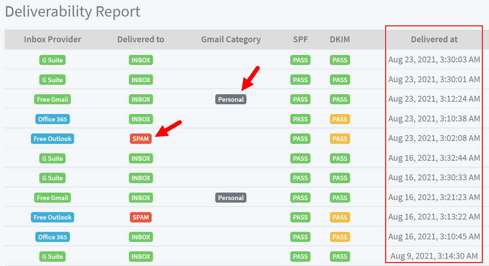
Your email service provider can tell you a message was "Delivered" and still leave out the part that matters most: whether anyone saw it. An email deliverability report fills that gap. It shows where your messages actually land across the major mailbox providers, how your sending reputation is trending, and which signals are dragging you toward the spam folder. This guide walks through what a deliverability report contains, how to read each metric, and how to turn the numbers into a fix.
What an email deliverability report tells you
A deliverability report answers one question your open and delivery stats cannot: did the email reach the inbox, or was it filtered out before anyone had a chance to read it. Delivery only confirms that a receiving server accepted the message. It says nothing about whether that server then routed it to the inbox, the Promotions tab, or straight to spam.
That distinction is the whole reason the report exists. Each mailbox provider applies its own filtering logic, so the same campaign can sit in Gmail's Primary tab and Outlook's junk folder at the same time. A good report makes those differences visible and gives you an early warning when something, usually authentication, reputation, or content, starts pushing you out of the inbox.
The core metric: inbox placement rate
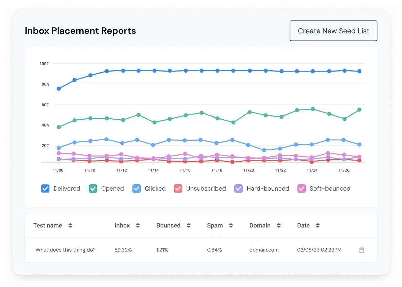
The headline number on most reports is your inbox placement rate, and it is reported per provider rather than as a single blended figure. Reading it provider by provider is what makes it useful. Expect to see:
- Inbox, spam, and promotions placement, so you know not just whether a message arrived but where it sat.
- Your inbox placement rate broken out across major providers like Gmail, Outlook, and Yahoo.
- Gmail tab categorization, showing whether you landed in Primary, Promotions, Updates, or Spam.
- Time to receive and the detected sender IP, which help you trace delays and identify the address actually sending your mail.
Because filtering differs by mailbox, a strong number with one provider does not guarantee the same result elsewhere. Treat the per-provider breakdown, not the average, as the real inbox placement rate you need to defend.
Engagement and complaint metrics
Beyond placement, most reports fold in the engagement and complaint metrics that mailbox providers themselves watch when deciding where to file you. These are the lines that explain why placement is rising or falling.
| Metric | What the report shows |
|---|---|
| Open rate | Percentage of recipients who opened, usually scored against a benchmark rather than read in isolation |
| Click-through rate | Percentage of emails with a clicked link, another engagement signal providers reward |
| Hard bounce rate | Percentage of emails that hard bounced, a direct hit to list quality and reputation |
| Unsubscribe rate | Percentage of sends that ended in an opt-out |
| Spam reports | The raw number of times recipients marked your mail as spam |
A rising hard bounce rate or a climbing spam-complaint count is the clearest sign your list or targeting needs attention before the placement numbers slide further.
Authentication and reputation signals
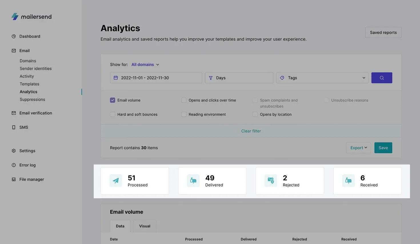
Some reports go under the hood and check the technical foundations of your sending. A tool that asks you to send a test message can analyze the email headers, the blacklist reputation of your outbound IP address, and your SPF records to flag setup problems that quietly hurt placement. If your sender reputation is slipping, this is often where the cause shows up first.
The authentication checks matter because providers use them to decide whether to trust you at all. A report that shows missing or misaligned records is pointing at the same foundation covered in our guide to SPF, DKIM, and DMARC. A blacklist flag is more urgent still, since a listed IP can sink placement across every provider until you get the address delisted.
Benchmarks and trends in the report
A single number rarely means much on its own, which is why the better reports wrap context around every metric. Look for these framing elements:
- A headline score, often on a simple scale such as one to ten, that rolls recent engagement into one figure.
- Each metric scored against a benchmark, either a general baseline or an industry-specific one, so you can tell good from average.
- A score-over-time chart that tracks reputation across roughly a year, turning a snapshot into a trend you can act on.
- Lists of high and low performing emails or contact segments, which point to exactly what helped or hurt.
Watch the trend line as closely as the current number. A score that is merely average but climbing is healthier than a high score that has started to fall, and the report's recommendations usually flag which metric to chase first.
How to generate a deliverability report
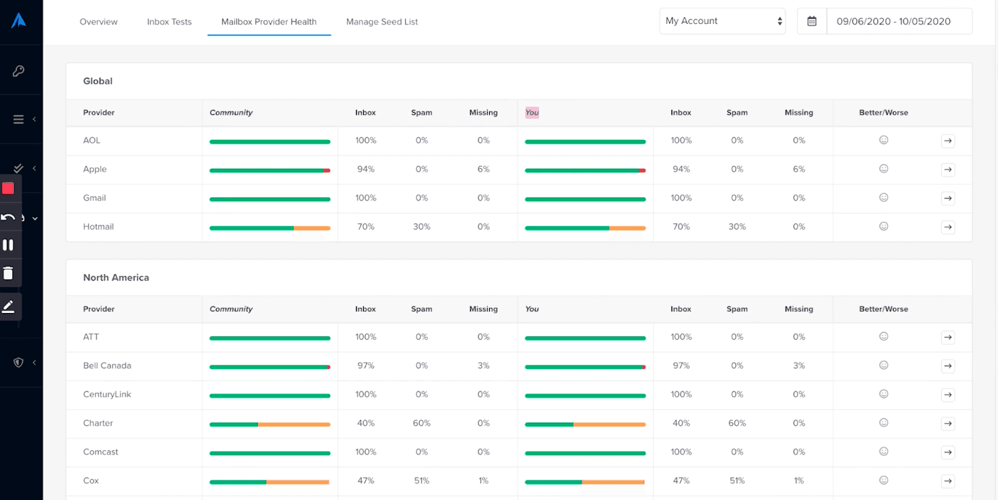
Most placement reports are built from a seed list, a set of real inboxes spread across providers that receive your test send and record where it lands. The flow is consistent across tools:
- Copy the seed inbox addresses the tool provides and paste them into your recipient field.
- Insert the generated tracking code into your email body so the system can match the message to your test.
- Send the email exactly as you normally would, ideally straight from your own ESP.
- Run the test and read the report, which shows inbox, spam, and promotions placement plus the provider-level detail.
Reputation and engagement reports work differently, pulling from your own send history once you have enough volume, and they often need a minimum number of recent sends before any data appears. One gap worth knowing: providers do not expose Gmail spam-complaint data to senders directly, so pairing a placement test with Google's free Postmaster Tools gives you the reputation view your report cannot.
Turn the report into action
A deliverability report is a diagnosis, not a cure. Once you can see where messages land and which metric is sliding, the report has done its job, and the next move is fixing the cause it surfaced. Falling placement at one provider points to authentication or content; a climbing bounce rate points to list hygiene; a spam-complaint spike points to targeting or frequency. Read the report on a regular cadence rather than only after a problem, and feed each finding into the broader work of keeping your messages in the inbox. Our guide on how to improve your deliverability covers the practices that move those numbers in the right direction.
BounceCheck Team
The team behind BounceCheck - helping businesses verify emails and improve deliverability.