SaaS Email Confirmation Page: What It Is and How to Build One

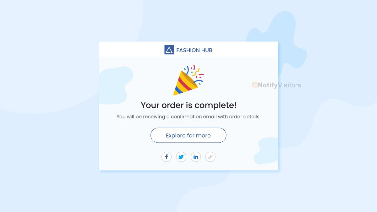
A SaaS email confirmation page is the screen a user lands on right after signing up, telling them to check their inbox and click a verification link to finish creating their account. It sits between registration and onboarding, and its whole job is to reassure the user, spell out the next step, and give them an easy way out if the email never arrives. Done well, it keeps new users moving toward activation instead of getting stuck.
This guide covers what the page is, the anatomy of a high-converting version, the verification email it depends on, best practices, and how to stop invalid signups from bouncing in the first place.
What is a SaaS email confirmation page?
The confirmation page is the "check your inbox" screen shown immediately after a user submits the signup form. It confirms the account was created, tells the user an email is on its way, and explains what to do next. The user then opens the email, clicks the confirm button, and gets redirected back to a success page or straight into the product.
Confirming the address matters for more than UX. It proves the email is real and controlled by the person signing up, which keeps fake and mistyped addresses out of your user base and protects the messages you send later.
Anatomy of a high-converting confirmation page
A confirmation page that actually converts covers five things:
- A clear hook: a short, welcoming message that the email is on its way, such as "Check your inbox."
- Actionable next steps: tell the user to open the email and click the verification link.
- A visual cue: a simple illustration or icon like an open envelope reinforces the state.
- The lifeline: a highly visible "Resend email" button for when the message does not arrive.
- Support access: a subtle link to your help center or support chat in case they made a typo.
Each element removes a reason the user might abandon the flow before verifying.
The verification email behind the page
The page is only half the flow; the email it points to has to be just as tight. A strong account verification email is short, sent immediately, tied to the exact action the user took, and free of unrelated marketing.
| Element | What good looks like | Common mistake |
|---|---|---|
| Subject line | Clear action: "Verify your email" | Clever or vague copy |
| Timing | Sent immediately after signup | Delayed batch delivery |
| CTA | One button to verify | Multiple product CTAs |
| Context | Names the product and action | No explanation of why it was sent |
| Security | Expiration window plus ignore-if-not-you note | Permanent links, no safety language |
| Accessibility | Button plus fallback URL | Button-only verification |
Trigger it from the signup event rather than a batch job, and keep product education for a later email once the user has verified. If you build these flows in code, our guide on how email verification works covers what happens behind that confirm link.
Confirmation page best practices
A few details separate a page that converts from one that leaks signups:
- Keep it branded: match the page's colors and fonts to your product so it reads as trustworthy, not as a phishing attempt.
- Include a whitelist reminder: mention that the email may take a few minutes and to check the spam or promotions folder.
- Provide an email edit option: let users correct the address they signed up with so a typo does not trap them in a loop.
- Auto-redirect on verification: listen for the token in the background so the user is sent to the dashboard the moment they click the link.
- Keep tracking minimal: open pixels, rewritten links, and shorteners add risk to the exact account emails users most need to trust, so track only what you need operationally.
Verify the address before it bounces
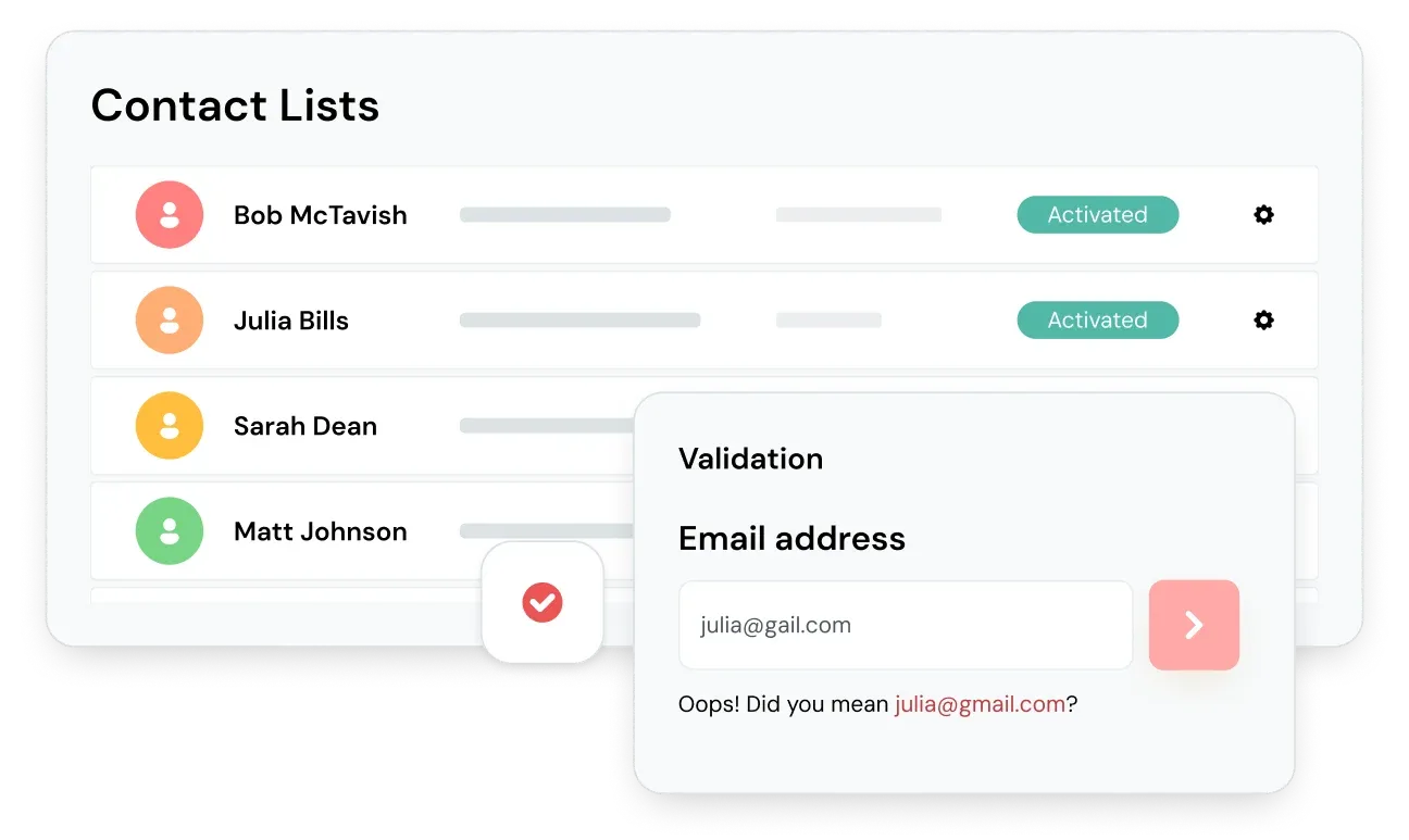
The most expensive confirmation-page problem starts before the page even loads: a user types an address that does not exist. When that happens, the verification email hard bounces, the user never activates, and your sending domain takes the hit. Running real-time email verification on the signup form catches those addresses at the point of entry, giving instant feedback before the confirmation email is ever sent.
Verification checks an address on three levels: syntax (is the format valid), domain (does the domain exist and accept mail), and mailbox (does the specific inbox exist). Good verification also flags accept-all, role-based, and free-provider addresses, so you can decide how to treat them before they ever reach onboarding.
Catching invalid addresses up front does two things at once. It prevents fake or fraudulent accounts from entering onboarding, and it keeps your bounce rate near the 2 to 5% industry norm instead of letting dead addresses drag down your sender reputation. That reputation cost compounds: once too many signups bounce, even the confirmation emails to your valid new users start landing in spam, and the whole flow quietly breaks. It also pairs naturally with a double opt-in flow, where the confirmation click is the second step. For teams wiring this into a signup backend, an email verification API validates each address the moment the form is submitted.
Handling problems on the confirmation page
Even a clean flow needs graceful failure states. Cover these cases:
- Email did not arrive: offer the resend button directly on the confirmation screen, and remind users to check spam or junk.
- Wrong address entered: let the user edit the email and resend rather than restarting signup.
- Expired or used link: route the click to a page that lets the user request a fresh verification email instead of showing a dead end.
- Still stuck: give a clear path to support so a typo or filter issue does not cost you the signup.
Common questions about SaaS email confirmation pages
Where do I find the email verification page?
It is the screen shown right after you submit a signup form, usually with a "Check your inbox" message. If you closed it, most products let you trigger it again from the login screen, which resends the verification email and returns you to the same confirmation state.
What should a confirmation email look like?
Keep it short and transactional: a clear subject line like "Verify your email," the product name, one verification button, a fallback URL, an expiration window, and a short note telling the recipient what to do if they did not sign up. Leave marketing content out of it.
How does email verification work in a SaaS signup?
When the user submits the form, the app sends a verification email containing a unique, time-limited token. Clicking the link returns the token to your server, which marks the address as confirmed and lets the account proceed. Real-time verification can also check the address for validity before that email is ever sent.
Should the confirmation page auto-redirect after verification?
Yes, when you can. Listening for the verification event and redirecting the user straight to the dashboard removes a manual step and gets them into the product faster, which improves activation.
BounceCheck Team
The team behind BounceCheck - helping businesses verify emails and improve deliverability.


